Mastering Responsive Web Design: A Guide by Codearoma Technologies
Mastering Responsive Web Design: A Guide by Codearoma Technologies
In today’s digital age, responsive web design has become indispensable. Ensuring your website looks great and functions seamlessly across devices of all sizes is crucial for user experience and SEO. At Codearoma Technologies, we understand the importance of mastering responsive web design techniques to deliver exceptional digital experiences. In this comprehensive guide, we’ll walk you through everything you need to know about creating responsive websites that impress and perform.
What is Responsive Web Design?
Responsive web design (RWD) is an approach to web development that ensures web pages render well on a variety of devices and window or screen sizes. Rather than creating separate websites for different devices, responsive design uses flexible grids and layouts, CSS media queries, and flexible images to adapt the layout to the viewing environment.
Why Responsive Web Design Matters?
- Improved User Experience: Users expect websites to be accessible and easy to use on any device they prefer—desktops, laptops, tablets, or smartphones.
- SEO Benefits: Google and other search engines prioritize mobile-friendly websites in their search results, leading to better visibility and higher rankings.
- Cost-Effectiveness: Developing a single responsive website is more cost-effective than maintaining separate desktop and mobile versions.
Key Principles of Responsive Web Design
- Fluid Grid Layouts: Designing using relative units like percentages instead of fixed pixels allows elements to resize proportionally to the screen size.
- Flexible Images and Media: Use CSS techniques such as
max-width: 100%;to ensure images and media scale appropriately without stretching or pixelation. - Media Queries: CSS media queries enable you to apply different styles based on the device’s characteristics, such as screen width, orientation, or resolution.
Conclusion - Mastering responsive web design is essential for creating modern, user-friendly websites that perform well across devices. At Codearoma Technologies, we specialize in implementing cutting-edge web development practices to ensure our clients’ websites are not only responsive but also engaging and functional. By following the principles and techniques outlined in this guide, you’ll be well on your way to creating responsive websites that leave a lasting impression.
Conclusion
Mastering responsive web design is essential for creating modern, user-friendly websites that perform well across devices. At Codearoma Technologies, we specialize in implementing cutting-edge web development practices to ensure our clients’ websites are not only responsive but also engaging and functional. By following the principles and techniques outlined in this guide, you’ll be well on your way to creating responsive websites that leave a lasting impression.
Recent Post
 The Ultimate Guide to Digital Growth in Ahmedabad
 How CodeAroma Technologies Can Help Your Business Succeed Online (A Complete Guide)
  Transform Your Brand Presence with the Best Social Media Marketing Agency in Ahmedabad – CodeAroma Technologies
 Website Performance: Strategies for a Faster, More Efficient Site
 Getting Started with WooCommerce Development
- Mastering Responsive Web Design: A Guide by Codearoma Technologies
 10 Best Strategies for Social Media Marketing
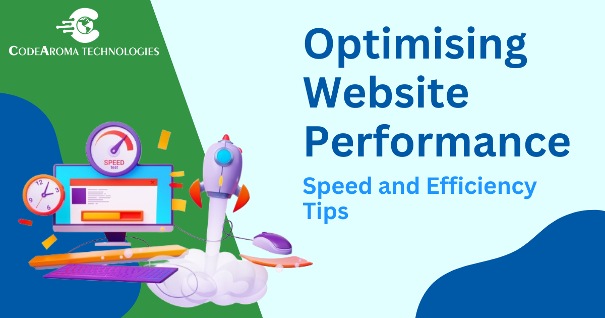 Optimising Website Performance: Speed and Efficiency Tips
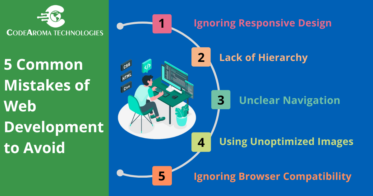 5 Common Web Development Mistakes and How to Avoid Them