Website Performance: Strategies for a Faster, More Efficient Site

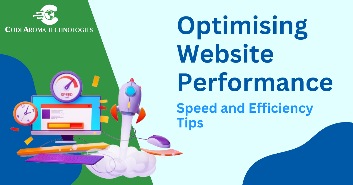
In the digital age, website performance is a critical factor in user experience, search engine rankings, and overall business success. A fast and responsive website can significantly impact user engagement, conversion rates, and customer satisfaction. At Codearoma Technologies, we understand the importance of optimizing website performance and are dedicated to helping you create websites that deliver outstanding results. In this blog, we’ll explore the best practices for website performance optimization and how they can enhance your online presence.

1. Understanding Website Performance

Website performance refers to how quickly and efficiently a website loads and operates for users. Key performance metrics include:

  • Load Time: The time it takes for a web page to become fully functional.
  • Time to First Byte (TTFB): The time it takes for the server to send the first byte of data.
  • Render Time: The time it takes for the browser to render the web page.
  • Interactivity: The speed at which the website responds to user inputs.
  • Page Size: The total size of all the resources loaded by a web page.

2. Optimizing Load Time

a. Minimize HTTP Requests

  • Combine Files: Combine CSS, JavaScript, and image files to reduce the number of HTTP requests.
  • Use CSS Sprites: Combine multiple images into a single sprite to reduce the number of image requests.
  • Implement Lazy Loading: Load images and other resources only when they are needed.

b. Use Content Delivery Networks (CDNs)

  • Leverage CDNs: Distribute your content across multiple servers worldwide to reduce latency and improve load times.
  • Optimize Caching: Use CDN caching to store copies of your website’s static content closer to users.

3. Enhancing Server Performance

a. Optimize Server Response Time

  • Use Fast Hosting: Choose a reliable and fast hosting provider.
  • Enable Compression: Use Gzip or Brotli compression to reduce the size of transmitted data.
  • Optimize Databases: Ensure your databases are optimized and use efficient queries.

b. Implement Caching Strategies

  • Browser Caching: Set appropriate cache headers to store resources in the user’s browser.
  • Server-Side Caching: Use caching mechanisms like Memcached or Redis to store frequently accessed data.

4. Improving Front-End Performance

a. Optimize Images

  • Compress Images: Use tools like TinyPNG or ImageOptim to compress images without losing quality.
  • Use Next-Gen Formats: Implement modern image formats like WebP for better compression and faster loading.

b. Minify and Defer Resources

  • Minify Files: Remove unnecessary characters from CSS, JavaScript, and HTML files.
  • Defer JavaScript: Defer the loading of JavaScript files to improve initial page load times.

5. Ensuring Efficient CSS and JavaScript

a. Optimize CSS

  • Reduce CSS Complexity: Simplify and clean up your CSS to reduce file size and complexity.
  • Remove Unused CSS: Use tools like PurifyCSS to eliminate unused CSS rules.

b. Optimize JavaScript

  • Avoid Inline JavaScript: Place JavaScript in external files to improve caching and maintenance.
  • Use Modern JavaScript: Implement modern JavaScript features and libraries for better performance.

6. Monitoring and Testing Performance

a. Use Performance Testing Tools

  • Google PageSpeed Insights: Analyze your website’s performance and get actionable recommendations.
  • GTmetrix: Evaluate your website’s speed and performance with detailed reports.
  • WebPageTest: Test your website from multiple locations and browsers for comprehensive insights.

b. Continuously Monitor Performance

  • Set Up Alerts: Use monitoring tools to set up alerts for performance issues.
  • Analyze User Feedback: Regularly review user feedback to identify and address performance concerns.

Conclusion

Optimizing website performance is an ongoing process that requires diligence and a proactive approach. By following these best practices, you can ensure that your website delivers a fast, smooth, and efficient experience that engages users and drives business success. At Codearoma Technologies, we are committed to helping you achieve top-tier performance for your websites. Contact us today to learn more about how we can support your web development needs!

Getting Started with WooCommerce Development

Introduction

WooCommerce has revolutionized the way businesses sell online by providing a powerful and customizable platform built on WordPress. At Codearoma Technologies, we specialize in WooCommerce development, helping businesses of all sizes create robust e-commerce solutions tailored to their needs. In this detailed guide, we’ll explore everything you need to know about mastering WooCommerce development—from setup and customization to optimization and beyond.


What is WooCommerce?

WooCommerce is an open-source e-commerce plugin for WordPress, designed for small to large-sized online merchants. It offers extensive features, flexibility, and customization options to create a fully functional online store.


Why Choose WooCommerce?

  1. Integration with WordPress: Seamless integration with WordPress allows for easy setup and management of your online store alongside your website content.
  2. Flexibility and Customization: Extensive themes and plugins, along with a robust REST API, provide limitless possibilities for customization and integration with third-party services.
  3. Scalability: Whether you’re selling one product or thousands, WooCommerce can scale with your business needs.

Conclusion

Mastering WooCommerce development empowers businesses to create robust and scalable online stores that meet their unique requirements. At Codearoma Technologies, we leverage our expertise in WooCommerce to deliver tailored e-commerce solutions that drive growth and enhance user experience. By following the steps and techniques outlined in this guide, you’ll be well-equipped to build and optimize your WooCommerce store effectively.

Mastering Responsive Web Design: A Guide by Codearoma Technologies

In today’s digital age, responsive web design has become indispensable. Ensuring your website looks great and functions seamlessly across devices of all sizes is crucial for user experience and SEO. At Codearoma Technologies, we understand the importance of mastering responsive web design techniques to deliver exceptional digital experiences. In this comprehensive guide, we’ll walk you through everything you need to know about creating responsive websites that impress and perform.


What is Responsive Web Design?

Responsive web design (RWD) is an approach to web development that ensures web pages render well on a variety of devices and window or screen sizes. Rather than creating separate websites for different devices, responsive design uses flexible grids and layouts, CSS media queries, and flexible images to adapt the layout to the viewing environment.


Why Responsive Web Design Matters?

  1. Improved User Experience: Users expect websites to be accessible and easy to use on any device they prefer—desktops, laptops, tablets, or smartphones.
  2. SEO Benefits: Google and other search engines prioritize mobile-friendly websites in their search results, leading to better visibility and higher rankings.
  3. Cost-Effectiveness: Developing a single responsive website is more cost-effective than maintaining separate desktop and mobile versions.

Key Principles of Responsive Web Design

  1. Fluid Grid Layouts: Designing using relative units like percentages instead of fixed pixels allows elements to resize proportionally to the screen size.
  2. Flexible Images and Media: Use CSS techniques such as max-width: 100%; to ensure images and media scale appropriately without stretching or pixelation.
  3. Media Queries: CSS media queries enable you to apply different styles based on the device’s characteristics, such as screen width, orientation, or resolution.

    Conclusion
  4. Mastering responsive web design is essential for creating modern, user-friendly websites that perform well across devices. At Codearoma Technologies, we specialize in implementing cutting-edge web development practices to ensure our clients’ websites are not only responsive but also engaging and functional. By following the principles and techniques outlined in this guide, you’ll be well on your way to creating responsive websites that leave a lasting impression.

Conclusion

Mastering responsive web design is essential for creating modern, user-friendly websites that perform well across devices. At Codearoma Technologies, we specialize in implementing cutting-edge web development practices to ensure our clients’ websites are not only responsive but also engaging and functional. By following the principles and techniques outlined in this guide, you’ll be well on your way to creating responsive websites that leave a lasting impression.

10 Best Strategies for Social Media Marketing

Social Media Marketing Strategies

➢   Define Goals and Objectives

➢   Identify Your Target Audience

➢   Follow the Competition

➢   Use Visuals to Tell a Story

➢   Monitor Trends

➢   Educate Your Audience

➢   Use Scheduling and Automation Tools

➢   Publish Content Consistently

➢   Use Chatbots and Engage Your Audience

➢   Use Social Media Analytics

❖   Conclusion

Introduction:

In today’s digital age, social media’s popularity has increased vastly. As per Statista’s reports, Social media has around 4.95 billion active users and is still increasing. It has also become the best tool for business to increase their brand value and engage their targeted audience. In this blog post, We have selected the top 10 best social media marketing strategies for businesses.

Social Media Marketing Strategies:

1.  Define Goals and Objectives:

Before Starting, it is most important that you have a clear goal in mind that you want to achieve through social media. Do you want to increase brand awareness, generate leads, or drive website traffic? Having this in mind will help create content and measure the results. But be sure that your goals are attainable and measurable.

2.  Identify Your Target Audience:

Identifying your target audience is an important factor for social media marketing success. Understanding your target audience is essential for creating content that resonates with them. Consider demographics, interests, and online behaviour when developing your target audience personas.

3.  Follow the Competition:

Keeping an eye on your competitors can be a valuable learning experience. Analyze their social media strategies, see what content performs well, and identify any gaps you can fill. However, avoid simply copying their strategies. Instead, develop your unique approach.

4.  Use Visuals to Tell a Story:

While text post is a great way of sharing information, people are more likely to engage with visually appealing content. Incorporating images, infographics, and videos into your social media content can be very beneficial for your brand. Use high-quality visuals that are relevant to your brand and message to capture attention and tell a compelling story.

5.  Monitor Trends:

Staying up-to-date on social media trends is crucial for staying relevant and engaging your audience. Stay ahead of the curve by keeping an eye on trending topics and hashtags. Participate in relevant conversations and create content that leverages current trends to increase your reach and engagement.

6.  Educate Your Audience:

Instead of constantly promoting your products or services, focus on providing valuable information and insights to your audience. Provide valuable information and insights that educate your audience so that your audience can consider your business as trustworthy.

7.  Use Scheduling and Automation Tools:

There are a variety of social media scheduling and automation tools available such as Hootsuite, Buffer and Sprinklr that can help you save time and manage your social media presence more efficiently. These tools allow you to schedule posts in advance, track their performance, and engage with your audience.

8.  Publish Content Consistently:

To maintain audience engagement, it’s important to publish content consistently. Develop a content calendar and stick to a regular posting schedule. The frequency of your posts will depend on the platform you’re using, but it’s generally recommended to post 5 times a week.

9.  Use Chatbots and Engage Your Audience:

Chatbots can be a helpful tool for answering customer questions, providing support, and driving sales. Consider implementing a chatbot on your social media pages to improve your response times and provide a more personalized experience for your audience.

10.              Use Social Media Analytics:

Track your social media analytics to measure the performance of your campaigns and gain valuable insights. These analytics can tell you what kind of content is resonating with your audience, what platforms are most effective, and where you can improve your strategy.

Conclusion:

Social media marketing is a dynamic journey that demands adaptability and innovation. By implementing these 10 social media marketing strategies, you can increase your brand awareness, engage your audience, and achieve your marketing goals. Remember, social media marketing is more effective in the long term, not in the short term. Be patient, and consistent, and adapt your approach based on your results, and you’ll be well on your way to social media success.

Optimising Website Performance: Speed and Efficiency Tips

7 Tips for Optimising Website Performance

➢   Consider Using CDN

➢   Make Fewer HTTP Requests

➢   Minify CSS and Javascript Files

➢   Serve Images in Next-Gen Formats

➢   Compress Files

➢   Use Website Caching

➢   Reduce the Number of Plugins

❖   Conclusion

Introduction:

In today’s fast-paced world, website speed is crucial. If your website is not performing fast enough you are losing a chunk of your major audience. A slow-loading website can annoy visitors, resulting in a higher bounce rate and potentially lost business. In this blog, We are going to show you some tips for optimising your website’s speed and performance.

7 Tips for Optimizing Website Performance:

1.  Consider Using CDN:

CDN (Content Delivery Network) is a geographically distributed group of servers that help to deliver your website’s static files such as CSS, images, fonts, and JavaScript to your audience. This allows visitors from all over the world to access your site from the nearest server, significantly reducing loading times.

2.  Make Fewer HTTP Requests:

Elements like Images, Stylesheets and Javascript from your website require an HTTP request. The more elements you add to your site the more HTTP request it requires. Minimizing the number of requests by combining files or using CSS sprites can significantly improve speed. As per “All in SEO” a website needs to make less than 20 HTTP requests per every single web page.

3.  Minify CSS and Javascript Files:

By minifying CSS and Javascript you can reduce the load time of your website. This includes removing unnecessary characters like whitespace, comments, line breaks, unused functions and variables and formatting from CSS, JavaScript, and HTML files. This can be done manually as well as through online tools.

4.  Serve Images in Next-Gen Formats:

Next-gen formats such as WebP or AVIF provide superior compression features compared to PNG, JPG and all the other web image formats. They offer significantly smaller file sizes compared to traditional formats, without sacrificing quality. Consider implementing tools that automatically convert your images to these next-gen formats.

5.  Compress Files:

The more you can reduce file sizes without compromising quality, the better your website performance. Compressing your website’s files using tools like Gzip can significantly reduce their size without affecting their content. This can be particularly beneficial for large files like HTML, CSS, and Javascript.

6.  Use Website Caching:

Website Caching is a feature that stores a copy of your site’s data in a temporary location on the user’s computer for future reuse. This means users don’t need to download the same elements every time they visit your site, resulting in faster subsequent page loads. In addition to speed boost, caching improves site ranking, bandwidth efficiency, user experience, and conversions.

7.  Reduce the Number of Plugins:

Plugins offer your website various functions and features making it look unique. But it also comes at a cost, Every plugin adds its own CSS and Javascript to the website making it slow. The less plugins are used the less website will slow down. So you should only use the needed plugins and remove the unused ones from the website.

Conclusion:

Optimising your website’s performance is a continuous process that requires attention to detail and a commitment to efficiency. By implementing these optimisation techniques, you can significantly improve your website’s performance and provide a superior browsing experience for your users. Remember, a fast and efficient website is not just about aesthetics; it’s essential for user engagement, conversion rates, and ultimately, your website’s success.

Additional Tips:

●    Choose a reliable web hosting provider with a strong infrastructure.

●    Optimize your database for efficiency.

●    Monitor website performance using tools like Google PageSpeed Insights and GTmetrix.

●    Regularly test and refine your optimisation efforts for continuous improvement.

5 Common Web Development Mistakes and How to Avoid Them

5 Common Web Development Mistakes

➢   Ignoring Responsive Design

➢   Lack of Hierarchy

➢   Unclear Navigation

➢   Using Unoptimized Images

➢   Ignoring Browser Compatibility

❖   Conclusion

Introduction:

In today’s digital era, a well-designed website is crucial for any business or company. It’s your online storefront, your online presence, and sometimes, your first impression. But with so much to consider during website development, even seasoned professionals can fall into common traps. This blog post will explore five common web development mistakes and guide you on how to avoid them, ensuring your website delivers an optimal user experience.

5 Common Web Development Mistakes:

1.  Ignoring Responsive Design:

How individuals connect to the internet has undergone a significant transformation. In 2022, more than 58% of worldwide website traffic was attributed to mobile devices. If your website isn’t responsive, meaning it doesn’t adapt its layout to different screen sizes, you’re losing a large chunk of your potential audience. If Users on smartphones and tablets are met with clunky interfaces, unreadable text, and frustrating navigation, it will lead them to bounce off your site quickly.

Solution: Choose responsive design techniques from the get-go. Implement CSS media queries to adapt layouts, fonts, and images according to screen size. Use frameworks such as Bootstrap or Foundation to simplify this procedure.

2.  Lack of Hierarchy:

A website without a clear hierarchy is like a cluttered room; it’s overwhelming and difficult to navigate. Information should be presented to guide users towards the most important content. This means using headings, subheadings, bullet points, and white space to create a visual hierarchy that directs the user’s eye and helps them understand the importance of different elements.

Solution: Plan your website’s information architecture carefully. Group related content together, utilize clear and concise headings and leverage white space to create visual separation.

3.  Unclear Navigation:

Imagine entering a store where you need help finding the exit or the products you’re looking for. A perplexing navigation system can deter website visitors. Aim for a straightforward, intuitive navigation menu that enables users to locate desired information swiftly and effortlessly.

Solution: Limit the number of navigation options to the most essential ones. Employ clear and concise labels for every menu item. Ensure consistency in placement and design across all pages.

4.  Using Unoptimized Images:

Images are powerful tools for enhancing your website’s visual appeal and storytelling. Nevertheless, oversized and unoptimized images can considerably hinder your website’s loading speed. This not only frustrates users but also hurts your search engine ranking.

Solution: Compress images before uploading them to your website. There are many free online tools and plugins available to help you achieve this. Consider using alternative image formats like JPEG or WebP, which offer better compression without sacrificing quality.

5.  Ignoring Browser Compatibility:

While most users stick to a few popular browsers, it’s important to ensure your website functions properly across different browsers and devices. Inconsistencies in layout, functionality, or styling can lead to a negative user experience and lost conversions.

Solution: Test your website thoroughly on a variety of browsers and devices during development. Utilise browser developer tools to pinpoint and resolve any compatibility issues. Consider using cross-browser testing services to streamline this process.

Conclusion:

By avoiding these common mistakes, you can create a website that is not only visually appealing but also user-friendly and effective in achieving your goals. Remember, a well-developed website is an investment that pays off in the long run, attracting visitors, converting leads, and enhancing your online brand reputation.

let's

connect